Many popular visual effects that previously required background images and the use of your Favourite Graphics Editor (FGE or Photoshop for short), can now be done with CSS3 magic. Here is a quick overview of six crucial CSS3 features.
Before We Start: Browser support is an issue with these features. You’ll need a decent, lets say ‘modern’ browser, such as a recent version of Chrome, Safari, Firefox or Internet Explorer 9/10. Even then they can be inconsistencies. I’ll draw out some of the inconsistencies amongst ‘modern’ browser but am going to ignore older versions of IE as We Need to Talk About Internet Explorer.
Border Radius
Everyone loves a rounded corner. Steve Jobs was positively nuts about them. Set all four at once or pick them off individually.
/* add a basic border */
border: 2px solid #555;
/* all four */
border-radius: 10px;
/* top left only */
border-top-left-radius:10px;
Values should be positive numbers. Bigger values are more curvy as what you are actually doing is setting the radius of the circle used to create the curve. Elements with higher widths and heights can take bigger values but eventually you can curve no more.
You can also apply two radii – horizontal first and vertical second to achieve other border effects.
/* add a basic border */
border: 2px solid #555;
/* all four */
border-radius: 4px 10px;
As these features are not supported by all browsers we have the contentious issue of vendor prefixes. These are prefixes added to each property as a temporary stop gap until the standard is formalized. As such this can be a moveable feast. For border-radius we would need the following:
border-radius: 4px;
-webkit-border-radius: 4px;
-moz-border-radius: 4px;
The Vendor prefixes are as follows:
| Browser | Layout Engine | Vendor Prefix | Example |
|---|---|---|---|
| Chrome | Webkit | -webkit- | -webkit-animation-duration |
| Firefox | Gecko | -moz- | -moz-column-count |
| Internet Explorer | Trident | -ms- | -ms-background-position-x |
| Opera | Presto | -o- | * |
| Safari | Webkit | -webkit- | -webkit-animation-duration |
| * Opera adopting -webkit | |||
For adding rounded corners to pre-IE9 versions of IE we need to talk about Internet Explorer.
Box Shadow
Now we have a border time for a shadow (once the providence of Photoshop).
box-shadow: 4px 4px 4px #555;
Results in:
box-shadow: [‘inset’], horizontal offset, vertical offset, [blur distance, spread distance,colour value]
box-shadow: inset 2px 2px 8px 8px #555 ;
Results in:
Vendor prefixes would be:
border-radius: 4px;
-webkit-border-radius: 4px;
-moz-border-radius: 4px;
Text Shadow
So shadows on boxes are okay but lets now have text shadow as well.
text-shadow: 2px 2px #fff;
text-shadow: horizontal offset, vertical offset, [blur distance, spread distance,colour value]
More than one shadow can be added and when done subtly can look rather good.
.ts2 {
	font-family: Helvetica, Arial, sans-serif;
	font-size: 20px;
	color: #E0C9A5;
	text-shadow: -1px -1px #fff, 1px 1px #333;
	padding:15px;
}
.ts3 {
	text-shadow: 1px 1px #fff, -1px -1px #444;
}
When the two classes above are applied to an element it results in:
As text-shadow boasts good browser support no vendor prefixes are needed.
Warning: Time for a timely reminder. Support for these features is lacking in old school IE6, IE7 and IE8.
Gradients
Background gradients don’t require a new CSS property but make use of the background property. Values can be either linear or radial with values dictating the colour, direction and strength of the gradient.
Syntax variables for linear and radial (and horizontal) gradients. There is also an issue that webkit based Safari prior to version 5.1 used a slightly different syntax to that now adopted.
  /* Safari 4+, Chrome */
  background: -webkit-gradient(linear, left top, left bottom, from(#ffff00), to(#ffffff));
  /* Chrome 10+, Safari 5.1+, iOS 5+ */
  background: -webkit-linear-gradient(top, #ffff00, #ffffff);
  /* Firefox 3.6-15 */
  background: -moz-linear-gradient(top, #ffff00, #ffffff);
  /* Opera 11.10-12.00 */
  background: -o-linear-gradient(top, #ffff00, #ffffff);
  /* Firefox 16+, IE10, Opera 12.50+ */
  background: linear-gradient(to bottom, #ffff00, #ffffff);
  /*  IE 10 */
  background: -ms-linear-gradient(top, #ffff00, #ffffff);
}
There are endless permutations of the gradient.
Check out the some of the great tools for generating gradients online:
Warning: IE9 does not support gradient. See We Need to Talk About Internet Explorer for workarounds.
Opacity
Give elements transparency with opacity. Takes values of 1 to 0 where 1 is opaque and 0 transparent. As such decimal values such as 0.5 and 0.75 are the order of the day.
opacity: 0.5;


RGBA
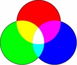
When we set colors in web design we use RGB – Red, Green, Blue.

… and we represent them as hexidecimal colours:

As any Photoshop user should know there is also something called Alpha. This represents the opacity of a colour known as it alpha channel. With CSS3 you can create colours with RGBA – the A been Alpha. Instead of using hexidecimal colour codes we values between 0-255 for the red, green the blue and then a value between 0 and 1 for alpha (as we did with opactiy).
Like gradients above this trick is used on the background property ie:
background:rgba(255,255,0,0.5);
So we can create layer effects by nesting elements and using RGBA values on the child elements as follows:
Don’t forget We Need to Talk About Internet Explorer.
Three is a magic number.
The new CSS 3 features are great, but I’ve found the best way to back them up is use Modernizr (http://modernizr.com/), a feature detector that works with all browsers and lets you provide an alternative for older browsers.