The concept of ‘flexible box’ or flexbox is name of the CSS3 flex layout model. Flexbox is based around flex containers and flex items.
A flex container is a parent element to flex items. Flex items are the immediate children of the flex container and can be laid out in any direction.
Take the following simple HTML structure.
<div class="container">
    <div>Item One</div>
    <div>Item Two</div>
    <div>Item Three</div>
</div>
Apply the following CSS.
.container{
    display: flex;
}
The <div class="container"> is now set as a flex container and the child <div> elements are flex items.
There is a range of CSS properties that can be used on both containers and items.
New display Values
Flexbox adds flex and inline-flex as options to the display property. Both make the target element a flex container. With flex the element is treated as a block element, and with inline-flex an inline element.
Using flex to set the container as a block element is the most common scenario.
See the Pen Set Container as Flex by Martin Cooper (@mustbebuilt) on CodePen.0
But you do have the flexibility to use inline-flex to render the container as inline.
See the Pen An inline-flex Container by Martin Cooper (@mustbebuilt) on CodePen.0
By setting the container as a flex, immediate child elements of the container will now behave as flex-items.
The flex-wrap Property
Once a flex container has been declared flex items will try to fit into the container. By default they will try to fit horizontally and will be reduced in width in order to fit the flex container.
With the flex-wrap property options of nowrap (default), wrap and wrap-reverse can be set.
The main axis and the cross axis
A key concept of flexbox is the idea of the ‘main’ and ‘cross’ axis. By default the main axis is horizontal and the cross axis vertical.
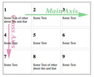
The flex-direction Property
By default a flex container’s main axis is from left to right horizontally. This is equivalent to the flex-direction property been set to row. In this situation the ‘cross axis’ is the vertical axis. However, if the flex-direction property been set to column then the main axis becomes the vertical axis and the cross axis the horizontal.
Both row and column have reverse values of row-reverse and column-reverse which change the flow of the flex items to right to left and bottom to top respectively.