Page Layouts
We have seen how to add text, links and images. To make these pages look more professional we need to consider page layout. When deciding on a page layout in web design you will need to consider the same screen resolution issues discussed above in relation to images. As a designer you will need to choose which kind of page layout is going to best suit your target audience.
Wire Frames
In web design grid layouts are the most commonly used technique for laying out a page. These layouts are often produced in a wire frame format before the addition of the branding – colour scheme, fonts, images etc.
You may choose to roughly draw the wire frame with pen and paper. However you choose to wire frame this is your opportunity to think about the information hierarchy of your site and how you want to present that information to your user.
Wire framing as a paper exercise misses one important aspect of web design. That is you are not designing for print but for a computer screen. The computer screen varies in size. Also unlike in print, you can choose to have your layout resize for different computer screens – a technique known as liquid or fluid.
Fixed versus Fluid
These variables mean that you need to think carefully about the type of page layout you use. The key point to be aware of is the need to avoid scroll, in particular horizontal scroll. A web designer has two distinct options – Fixed or Fluid.
Fixed Page Layout – Choose a page layout with a fixed width size in pixels. Here you need to decide what is the best width for your page layout. What size is going to minimize scoll? A common settting is around the 900/1000 pixel mark as the 1024×768 screen resolution is very common. The downside of this approach is although the layout will look the same on different screen resolutions, there will be more dead space (usually white space) on a higher screen resolution such that the design does not make good use of the screen space.

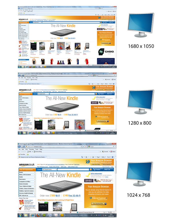
With the above screenshots the web page uses a fixed width layout. Notice how there is unused space on the higher resolutions to the left and right hand margins. However, on the lowest resolution (1024 x 768) the content fits exactly on the page. This site has been designed with 1024 x 768 as its base users.
Fluid Page Layout – Alternativelty choose a page layout which is fluid. That is the width of the layout is set as a percentage. A percentage of what? A percentage of the available screen space. A common setting for this is 100% such that the page layout always fill the space available. The downside of this approach is the pages will look different on screens with different screen resolutions. Wider screen resolutions will make the content short and fat, less-wide screen resolutions will make the content narrow and thin.

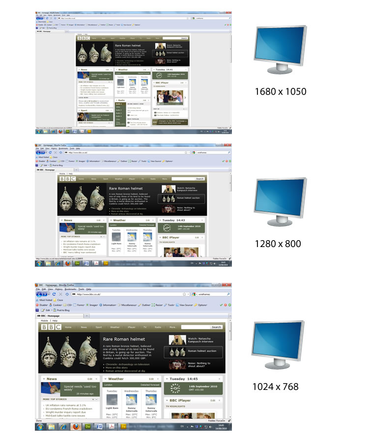
Above we have screen shots of the same web page but viewed on monitors with different screen resolutions. Notice how the higher the resolution the more content is visible. This is because this page is set to be fluid ie always used 100% of the available screen space. On lower screen resolutions the content is squashed into the centre and less content is visible. However, all of the available screen space is used whatever the screen resolution.
Which to use?
There is no right or wrong approach. It very much depends on the aim and target audience for the web site. For example a lot of eCommerce sites that want to maximize use of the screen space will use the fluid technique. Whereas a lot of newspaper sites that like to keep a consistency of appearance will use the fixed technique.
What value to fix on?
If you do decide to use a fixed design you need to think about the value you fix at. Screen resolution useage statistics change all the time and will vary from site to site. Currently the 1024 x 768 resolution is still in the majority but will inevitably be overtaken by larger resolutions at some point in the future. The width 960 pixels is currently popular as it fits within the 1024 screen and divides nicely to create a grid.
Dreamweaver CSS Layouts
Creating a layout is quite complicated. Fortunately Dreamweaver CS5 comes with 16 preset layouts that have been professionally produced and are likely to meet your initial design requirements. Both fixed and fluid layout styles are represented. All the layouts are completed editable if you don’t find one that perfectly suits your needs.
These layouts are known as CSS layouts. CSS stands for Cascading Style Sheets the technology used to create the page layouts. The layout designs have been tested by Adobe such that they work in all major browsers.
Understanding the Dreamweaver CSS Layout Options
The Dreamweaver CSS layouts are provided for both fixed and fluid or (liquid) designs.
 |
Fixed Column – The easiest option to understand. The width of the column is specified in pixels. As such the column does not resize based on the size of the browser or the site visitor’s text settings. |
 |
Liquid Column – Or ‘fluid’ as described above. That is the width is specified as a percentage of the site visitor’s browser width. The design adapts if the site visitor makes the browser wider or narrower. |
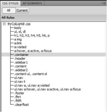
Any layout you choose is controlled by Cascading Stylesheets (CSS). They are edited via the CSS Styles panel which can be opened by selecting Window > CSS Styles. In the CSS Styles panel you will see a list of what are known as CSS rules. These are the formatting rules for each section of the layout. By taking your time you should be able to identify which rule applies to which part of your layout ie. .header, . sidebars. footers. These rules apply to the main blocks of the layout ie the headers, sidebars and footers.
Tip: the <body> tag is always listed as a rule. The <body> tag in HTML encloses all of the visible elements of the document and is thus used for settings default fonts and colours.
Creating a Page with Dreamweaver’s CSS Layouts
Working with Dreamweaver’s layouts is relatively straight-forward. In this example we will create a 3 Colum Liquid layout with header and footer. This is a classic layout used by amongst others Amazon.
- In the document window, select File > New to open the New Document dialog box.
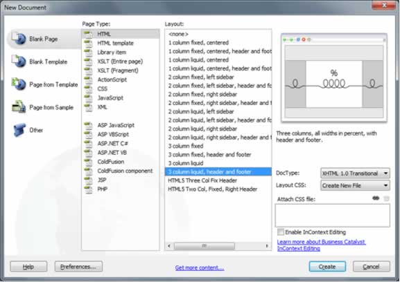
- The Layout options are listed and a preview box indicates how the layout will appear.

- Choose the “3 Column liquid, header and footer” from Layout column. It is bottom of the list! Click create.
The page layout opens using text that cleverly helps you understand how the layout works and how it should be edited. These starter layouts are effectively simplified wire frames to get you going.
To Customize the Default Layout.
The layout template provided by Dreameaver uses a technique called CSS (Cascading Stylesheets). To edit the default scheme we need to use the ‘CSS Styles’ panel.
- Select Window > CSS Styles. The CSS Styles panel will open on the right-hand side. Click the ‘All’ button underneath the panel name to see a list of all the “style rules” that have been created for you.
- To change the width of the layout select the “.container” rule. At the bottom of the panel change the width value from 80% to 100%. You can also use this rule to change the colour scheme.
- To change the background colour of the whole document, the font and font colour select the ‘body’ tag rule.
- To change the colour scheme of the each part of the document select the appropriate rule ie:
- “.footer” controls the appearance of the footer.
- “.sidebar2” controls the appearance of the right hand side bar.

When adding images that you want text to flow around there are miscellaneous rules provided for you. These will appear as styles in the Properties inspector.
- “.fltlft” for left alignment using CSS float left.
- “.fltrt” for right alignment using CSS float right.
A default logo has been placed in the header. Delete this image and replace it with your own.